Learn about photo framing so that your travel shots look as good as postcards. The rule of thirds, composition tips, positioning your subjects … Here’s a close-up on photo framing.
Horizontal or vertical
Horizontal format is recommended for landscapes, while vertical is mostly used for portraits and landscapes where the focus is on an up-and-down element, such as a waterfall or a church tower.
The rule of thirds
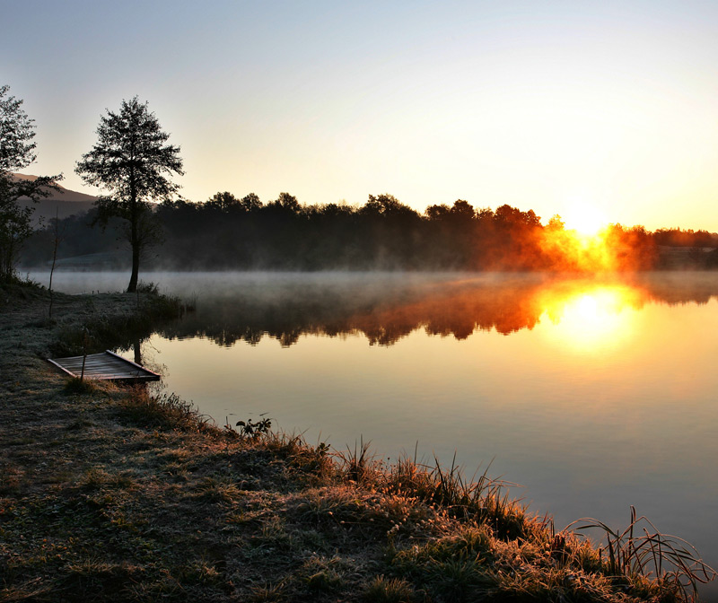
When taking a picture of a wide open space (sand, mountains, water), framing is key. Make the grid appear on your viewfinder and use the rule of thirds: the screen is divided into 9 squares. Place the horizon on the highest horizontal line – never in the centre. Your subjects (or foreground) will be to the side of one of the intersections. For a portrait, apply the same rule, placing your model’s eyes at an intersection on your grid.
5 points to improve your framing
- Plan your foregrounds to provide some contrast: a tree next to the water or a net stranded on the beach will give your photo some perspective.
- Leave space in front of your subjects’ eyes, especially if they are moving.
- Play with the scenery: two posts from a bridge, an opening in a bush or line of trees will provide you with natural, visually pleasing framing.
- Create a point of reference: The presence of a person in your photo will highlight the immensity of the landscape before you (river, mountain, desert).
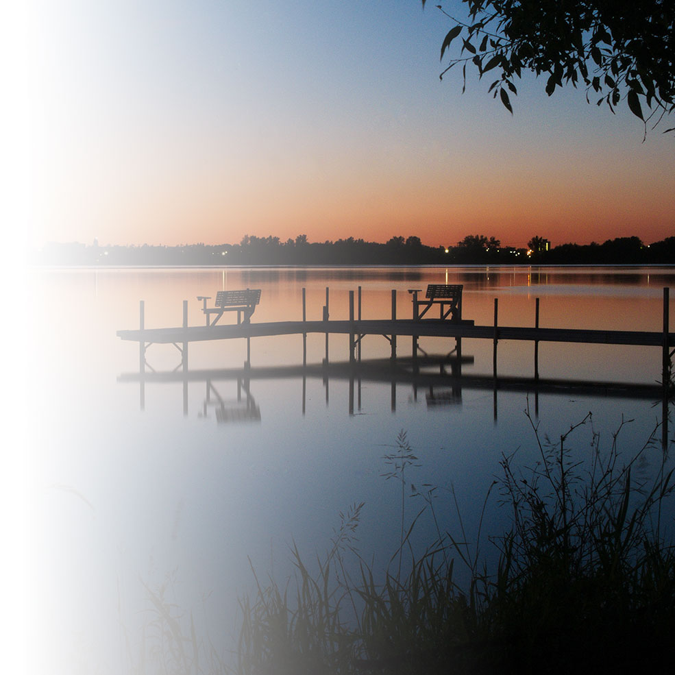
- Guide the viewer’s eye by using the natural lines of your landscape, such as a path leading to a building, or a dock heading out to a lake.

Re-framing … at home
If your photos didn’t turn out, don’t worry! If you take high definition photos (8-10 megapixels or more), you can always make up for it by reframing your shots with an image processing software. The photos will be a lower resolution, but still good enough for printing in the classic format.

